Book Book: A Playful Display Font for Digital Branding
As a UI designer who ships dozens of landing pages, SaaS dashboards, and e-commerce experiences each year, I pay close attention to how typefaces shape perception before a single word is read. Book Book stands out—not as a workhorse body font, but as a thoughtful, expressive display font that adds warmth, approachability, and intentionality to digital interfaces where personality matters.
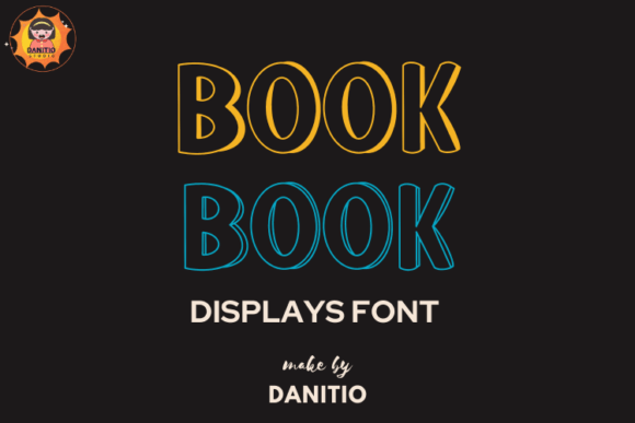
Visually, Book Book balances rounded geometry with gentle contrast and soft terminals—think friendly chalkboard lettering meets clean vector precision. It’s not a script or handwritten font, nor does it lean into exaggerated whimsy. Instead, it delivers consistent spacing, open counters, and generous x-heights that hold up beautifully on screens—even at smaller sizes in responsive headers or mobile banners. Its charm lies in restraint: it feels handmade without sacrificing legibility or typographic control.
Where Book Book Earns Its Place in Web Layouts
In practice, Book Book thrives in high-impact, low-density contexts. It’s ideal for hero section headlines, product name treatments, course title cards, CTA buttons with short labels (“Get Started”, “Join Now”, “Explore Kits”), and branded section dividers on portfolio or coaching sites. Because it’s a display font, it’s not intended for long-form reading—but it excels where you need tone, memorability, and visual rhythm.
For example, a boutique online store selling illustrated children’s planners uses Book Book for category headers (“My Weekly Goals”, “Story Time Journal”) while pairing it with a neutral sans serif (like Inter or Manrope) for product descriptions and pricing. The result? Immediate emotional resonance paired with effortless scanning. Similarly, a digital course platform uses Book Book for module titles overlaid on soft-gradient backgrounds—creating clear hierarchy without competing with supporting text.
Readability & Responsiveness: Practical Considerations
Book Book performs reliably across devices when used intentionally. On desktop, it shines at 32–60px in hero areas with sufficient line height (1.2–1.4). On mobile, keep it above 24px for headings and avoid tight tracking—especially over image overlays or dark mode backgrounds. Its even stroke weight and open shapes prevent visual noise, even against textured or busy backgrounds.
That said, avoid using Book Book for body copy, form labels, navigation links, or small interface elements like tooltips or badge text. Its decorative nature works best when given breathing room—and when contrasted with highly legible supporting fonts. Always test contrast ratios: Book Book on light backgrounds passes WCAG AA at size 24px+, but pair it with a robust sans serif for accessibility-critical text.
Font Pairing for Balanced Digital Identity
The real power of Book Book emerges in pairing. It pairs naturally with geometric sans serifs (Poppins, Montserrat), humanist options (Lato, Nunito), or even subtle serifs (Cormorant Garamond, Literata) for editorial-leaning brand experiences. Avoid clashing with other display or script fonts—its personality is strong enough to carry the voice alone.
A common, effective stack: Book Book for H1/H2 and key CTAs, Inter (variable or regular weights) for all body, caption, and UI text. This combination supports both brand warmth and functional clarity—critical for conversion-focused layouts where trust and tone coexist.
Licensing, Formats, and Real-World Deployment
Book Book is a premium font designed for commercial use—including websites, client projects, SaaS platforms, online stores, and digital templates. When licensing, confirm webfont support (WOFF2 is standard and recommended), and verify included styles: most versions offer Regular, with optional Bold or Italic alternates. Check multilingual coverage if your audience spans Latin, Greek, or Cyrillic scripts—many modern display fonts now include extended character sets.
For performance, serve Book Book via self-hosting (with proper CORS headers) or a trusted font service. Never load it alongside five other display fonts—prioritize one distinctive voice per project. And always define fallbacks: font-family: "Book Book", system-ui, -apple-system, sans-serif; ensures graceful degradation without layout shifts.
When Book Book Strengthens Brand Trust
Digital users assess credibility in under 500ms—and typography is a silent signal of care, consistency, and audience awareness. Book Book communicates thoughtfulness toward young audiences, educators, creatives, and wellness or learning brands—not through childishness, but through intentional softness and clarity. It signals that the brand understands its users’ emotional context.
A children’s literacy app uses Book Book for milestone badges (“First Story Written!”) and progress headers—making achievements feel joyful and tangible. A planner subscription site uses it in email subject lines and onboarding modals, reinforcing brand recognition across touchpoints. In both cases, Book Book isn’t just decoration—it’s part of the product’s voice architecture.
Final Implementation Notes
- Use sparingly: One prominent application per page is often enough—overuse dilutes impact and disrupts hierarchy.
- Test contrast early: Especially on dark themes, image overlays, or gradient backgrounds—adjust weight or background opacity as needed.
- Respect licensing scope: Ensure your license covers web embedding, SaaS usage, and resale if building digital templates or theme kits.
- Optimize delivery: Subset characters if possible, preload critical font files, and defer non-essential weights.
- Pair with purpose: Let Book Book express tone; let your body font deliver clarity, speed, and accessibility.
Book Book won’t solve every typographic challenge—but for designers building digital products where friendliness, creativity, and clarity intersect, it’s a reliable, expressive tool. It reminds us that great web typography isn’t just about function or flair—it’s about choosing the right voice, at the right moment, for the right people.