Halim: A Bold, Condensed Display Font for Modern Web Design
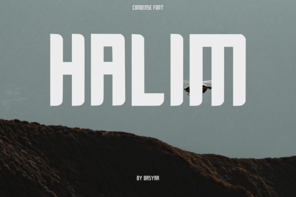
Last week, I was finalizing the hero section of a new landing page for a boutique online store selling handmade ceramics—and something felt off. The headline was clear, the imagery strong, but the typography lacked presence. It blended in instead of standing out. That’s when I reached for Halim: a tall, bold, all-caps display font with just enough rounded corners to soften its intensity without sacrificing impact.
Right away, Halim changed the rhythm of the layout. Its condensed proportions let me fit a short, confident tagline—“Handcrafted in Small Batches”—across the full width of the hero banner without crowding or shrinking the text. On desktop, it sat cleanly over a muted clay-toned background. On mobile, I adjusted tracking and line height slightly, and it held up beautifully—even at 32px on a 375px viewport. No pixelation, no awkward letter collisions. Just clean, intentional emphasis.
What makes Halim work so well in real digital layouts isn’t just its visual punch—it’s how its personality aligns with modern brand expectations. It’s not playful like a script font, nor austere like a high-contrast serif. It’s confident, grounded, and quietly distinctive. That balance makes it ideal for contexts where you need clarity and character in equal measure: coaching websites that want warmth without whimsy, portfolio sites that showcase craftsmanship, course sales pages where authority matters, or campaign landing pages built for quick scanning and emotional resonance.
In practice, I’ve used Halim for:
- Hero headlines—especially over image banners or gradient overlays (its bold weight ensures legibility even with subtle transparency)
- Section headings in multi-step product pages or service overviews (it creates clear visual breaks without competing with body copy)
- CTA buttons on minimalist templates (its condensed shape fits tightly in narrow mobile buttons while remaining highly scannable)
- Branded social media graphics and email headers (it scales cleanly across platforms and maintains recognition at small sizes)
- Digital brand kits, where consistency across web, PDFs, and presentation decks matters
That said, Halim isn’t meant for long paragraphs—or even medium-length subheadings. It’s a display font, purpose-built for moments of emphasis. Trying to use it for body text would hurt readability and undermine its strength. Instead, I pair it with a neutral, highly legible sans serif—like Inter, Manrope, or even system fonts like -apple-system—for all supporting content. This contrast creates hierarchy naturally: Halim commands attention, then the supporting type invites reading. For more editorial projects—say, a design blog or creative newsletter—I’ll sometimes layer in a restrained serif (like Literata or IBM Plex Serif) for pull quotes or bylines, letting Halim anchor the top-level structure.
Readability testing revealed a few practical notes worth sharing. On light backgrounds, Halim’s bold weight shines—no need for text shadows. Over darker or textured backgrounds, I found that adding just 1–2px of subtle letter spacing improved character separation without diluting impact. And while it performs well on retina screens, I always preview it in Safari and Firefox—not just Chrome—to catch any rendering inconsistencies early. Halim also handles dark mode gracefully, especially when paired with a CSS color variable system that adjusts background contrast automatically.
Before dropping Halim into a live site, I double-checked what’s included: it ships with a single, optimized weight (ideal for fast-loading layouts), supports Latin-based languages out of the box, and comes in WOFF2 format—perfect for modern web delivery. There are no stylistic alternates or optical sizes, which keeps things simple and predictable. That’s a win for performance-focused projects, though designers needing fine-grained typographic control might supplement with a secondary display option for special cases (like logo lockups).
Licensing is straightforward—Halim is a commercial font, so it’s safe for client work, SaaS dashboards, e-commerce banners, and digital templates sold on marketplaces. I always verify license scope before embedding in a white-labeled product or reusable UI kit. No surprises, no last-minute swaps.
One unexpected win? Halim’s rounded corners make it feel more approachable than other condensed fonts—less “corporate command” and more “curated confidence.” That nuance mattered on a recent wellness coaching site where the founder wanted to signal expertise *and* empathy. Using Halim for her headline (“Clarity Starts Here”) gave the page instant gravitas, while the softness in the terminals kept it from feeling cold or distant.
It’s also proven versatile across industries. A friend used it for an indie board game launch page—its tight spacing worked perfectly alongside illustrated assets and game mechanics diagrams. Another designer applied it to a limited-edition print shop’s seasonal promo, pairing it with a delicate serif for product descriptions. In both cases, Halim didn’t dominate—it elevated.
If you’re evaluating Halim for your next project, ask yourself: Where does your layout need a moment of unmistakable focus? Not decoration. Not filler. A deliberate, confident statement. That’s where Halim lives—and why it’s become my go-to for headlines that land, CTAs that convert, and brand voices that feel both human and polished.